Are you making these common mistakes that turn off patients?
You’ve likely heard the saying, “A picture is worth a thousand words.” A photo that went viral on social media earlier this year proves the truth of that statement. As Forbes reported, a young boy in Arizona stopped “dead in his tracks” on a shopping trip when he saw an ad featuring a boy in a wheelchair, just like him. “He just stared at it in awe! He recognized another boy like him, smiling and laughing on a display at Target,” his mother wrote on Facebook, alongside a photo of her son.
This story shows the power of inclusive and diverse images in marketing. People want to see themselves reflected in the imagery brands and businesses are using to advertise to them. This includes medical practices. What impression is your website giving to prospective patients? Are you making these common mistakes with the images on your site?
The problem with stock photos
Previously in a two-part blog post, we addressed all the elements that make up an effective, patient-focused practice website. For most patients, it’s the first impression they get of your practice, and it’s how they decide if they want to schedule an appointment.
See Tips for a Perfect Practice Website: Part 1 and Tips for a Perfect Practice Website: Part 2.
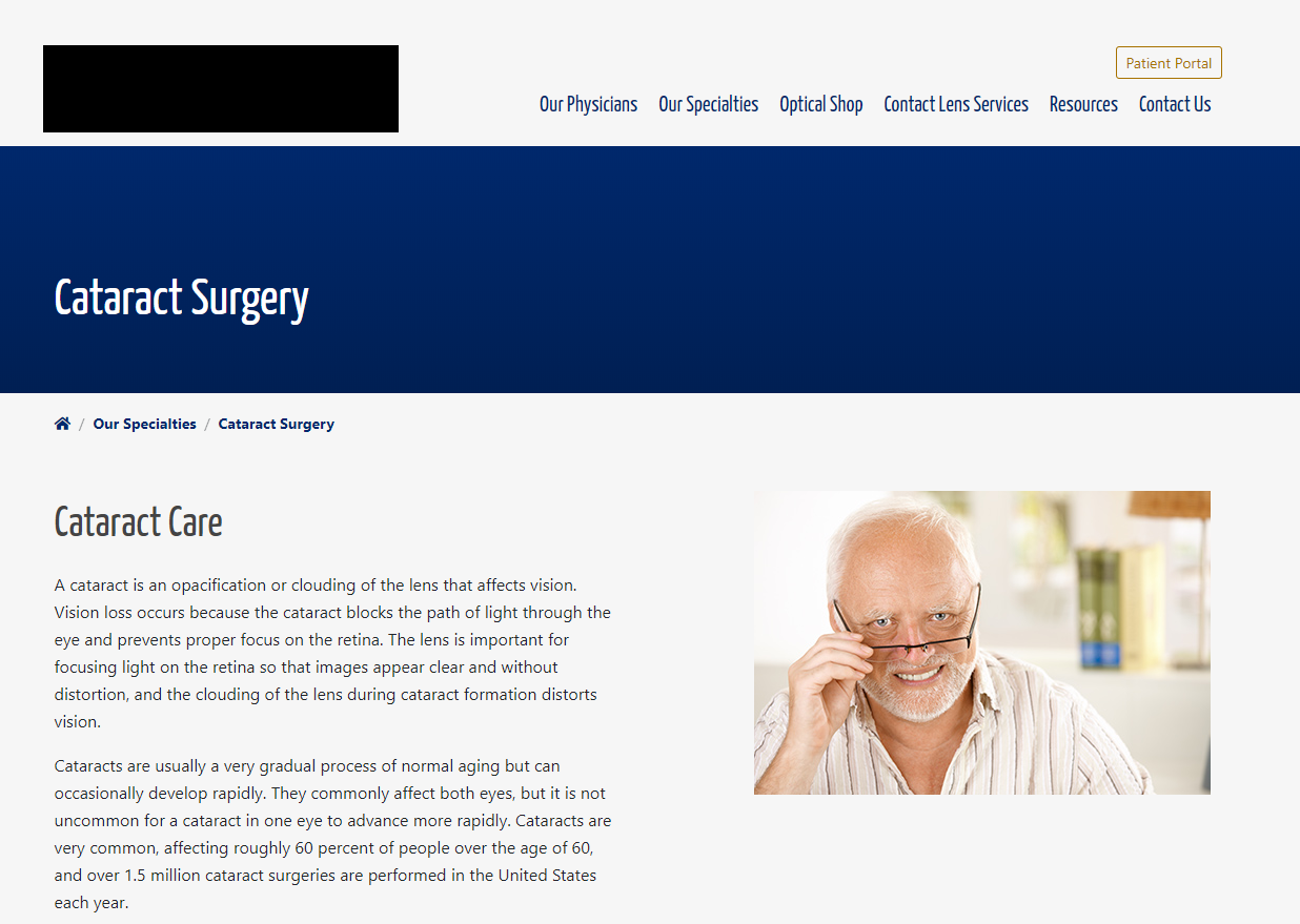
A big turnoff? Generic stock photos. You’d be surprised how many eye care practices use the same, tired stock photos of eye exams and elderly patients. If patients are researching multiple practices online and keep seeing the same image, especially one that doesn’t reflect them, they’ll most likely keep right on looking. Don’t make the mistake of using an image that many other websites are using—such as this one, that’s also widely known as the “Hide the Pain Harold” meme.

Eye-catching, original photos are easy to capture these days on just about any smartphone. There are tons of tutorials and tips online about how to take high-quality photos, such as this one from AppleInsider. One tip: turning off the flash and using natural light will always yield better photos.
Be sure to include pictures of all your providers, since the About Us page is one of the most-visited on practice websites. It makes sense: patients want to see who will be taking care of them. You can have some fun with props and filters on your staff page if you want to show some personality, like this practice did with photobooth-style pics of their employees. (Scroll down to the Meet Our Team section.)
Why diversity matters in marketing
If you don’t have the time, budget, or skills to take your own photos or hire a photographer for the rest of your website imagery, there are a number of stock photo sites that offer more diverse options than most, such as people of color, Muslim women, and trans and non-binary people not typically depicted in stock photos. Be sure to check the licensing agreement and any fine print, however: some sites stipulate that free photos can’t be used for commercial purposes.
Even the major stock photo sites are getting on board with inclusion and diversity. For instance, Getty Images has introduced The Disability Collection, featuring people with prosthetic limbs and wheelchairs.
Industry experts say that consumers—millennials in particular—respect brands and businesses that show diversity and underserved demographics, even if it doesn’t directly reflect who they are.
By the way, this has an even greater effect than attracting people that fit the exact demographic you’re depicting. The underwear brand ThirdLove said it received an overwhelmingly positive response, especially from millennial customers, after featuring a model in her 60s in a campaign. “We’ve seen that women respect brands that show diversity and underserved demographics, even if it doesn’t directly reflect who they are,” Chief Creative Officer Ra’el Cohen said in an industry article on inclusive marketing.
In fact, businesses of any type hoping to attract millennials (anyone born between 1981 and 1996)—the largest generation in the U.S.—would do well to pay attention to how they are marketing themselves online. A recent survey found that 88 percent of patients under age 40 said they will choose their next provider based on the provider’s online presence, according to PatientEngagementHIT. And 70 percent of millennials are more likely to choose one brand over another if that brand demonstrates inclusion and diversity in its promotions and offers, according to a 2018 survey.
Partner with companies that prioritize diverse imagery
Anyone trying to reach today’s consumers should be taking a fresh look at their website and marketing materials “and adopting representational images, to reflect modern day society,” according to Forbes. “Choosing images that are relatable to diverse groups will benefit their brand’s reputation.”
All of your imagery, from your website to your patient education, should reflect the diversity of modern day society.
This goes for patient education as well as practice marketing. Partner with companies that make diversity and inclusion a priority. For instance, Rendia pays close attention to the kind of imagery we use in our patient education videos to make sure they reflect a diverse patient population. “We look for photos of regular people, not models, of all ages and ethnicities. When we can’t find good content we make our own, either shooting or illustrating people…so patients will see at least one image that resonates with them,” says our CEO, Smitha Gopal. For example, check out our video on anosmia:
Let Rendia do some of the work for you by embedding our videos on your practice website. Websites with high-quality video content are more visually appealing, and they also improve SEO and lower bounce rate.

