Using visuals helps overcome numeracy issues and improves understanding
The COVID-19 pandemic and the U.S. election have shone a spotlight on a stark fact: many people struggle with numbers. It’s understandable that the daily barrage of statistics would cause confusion, given that only 9 percent of U.S. adults have proficient numeracy, or the ability to understand and interpret numbers, according to data from the U.S. Department of Education.
This is particularly a problem when it comes to health, since studies have found that adults who self-report the worst health also have the most limited literacy, numeracy, and health literacy skills. Understanding statistics is critical to weighing everyday risks and interpreting medical information, wrote Susan Keown of Seattle’s Fred Hutchinson Cancer Research Center.
Stress and fear further impact people’s ability to comprehend large numbers and complex information—say, due to a recent diagnosis or a global pandemic. That’s why illustrations, graphics, and other visuals are far better ways to communicate health information.
Relative vs. absolute risk
“Many doctors, patients, journalists, and politicians alike do not understand what health statistics mean or draw wrong conclusions without noticing, wrote the authors of a study published in the journal Psychological Science in the Public Interest. “For instance, many citizens are unaware that … the statement that mammography screening reduces the risk of dying from breast cancer by 25 percent in fact means that one less woman out of 1,000 will die of the disease.” Or, as Keown noted, “many people see a 10-in-100 chance as bigger than a one-in-10 chance, when in fact they are equivalent.”
Use absolute risks instead of relative risks when communicating health information, and use visuals, such as graphs.
One recommendation from the study authors is to use absolute risks instead of relative risks when communicating health information to patients and the public. Keown uses this example: “Let’s say that there is an updated medication that is effective for its intended purpose but doubles the risk of a potentially deadly side effect compared to the older version. Put another way, the risk of that dangerous side effect, on average, has increased 100 percent. Sounds scary.” However, she noted, that tells us the relative risk—how the risk gets bigger or smaller in different situations—but leaves out the size of the risk to begin with.
The same risk in absolute terms is: “Among 7,000 people who take the older version of the medication, one of them will have the side effect. Among 7,000 people who take the newer version, two will have the side effect.” Keown further illustrates this point by including a graphic that shows one and two dots in a 7,000-dot grid, which represents a small difference in absolute risk but a large difference in relative risk.
Visual patient education helps overcome barriers to care
Visuals make things easier to explain, understand, and remember. Critical information about a complex topic is retained better when it’s accompanied by a visual. Look at the example of the CDC’s “flatten the curve” image: one simple graph explains a complicated message to millions of people across the globe about lessening the spread of COVID-19.

Check out and share our patient education infographic today
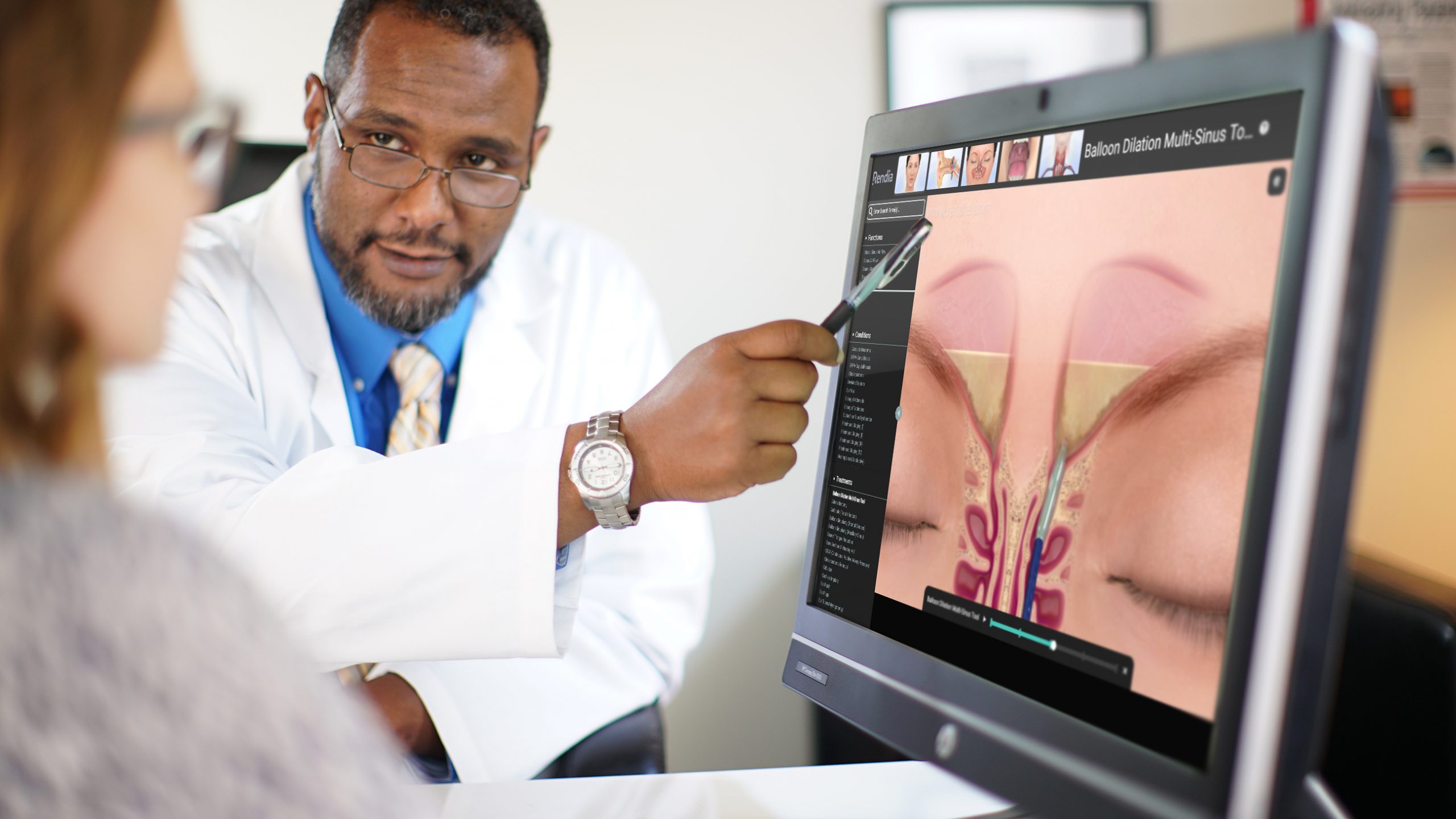
Using visual tools like patient education videos helps maximize in-person doctor-patient time, improves comprehension, and loops in caregivers.
Using visual patient education also overcomes some other obstacles. It:
- Saves time. Doctors have limited time with patients, even more so now because of COVID-19. You may be trying to minimize your contact with patients to avoid exposure risk, leaving you only enough time to perform tests and examinations in person, not explain basic health concepts or answer routine questions. Patient education videos sent before and after the appointment can save you time.
- Overcomes barriers to understanding. Telemedicine has increased dramatically during the pandemic. This can cause problems for patients, such as seniors, who struggle with technology and perhaps also seeing and hearing a doctor clearly through a screen. Patients who aren’t fluent in English might also have more trouble taking in information during a telehealth appointment. Visuals can help bridge this gap.
- Can be shared with caregivers. COVID-19 visitor restrictions mean that many patients can no longer bring a family member or caregiver with them to appointments. Digital patient education is easy to share with caregivers before and after appointments, helping to keep them in the loop and facilitate shared decision-making.
The majority of the population is thought to be visual learners—people who retain information better by seeing pictures and videos rather than reading text or hearing information delivered orally. Combined with low levels of health literacy and numeracy, this makes a strong case for visual patient education. And digital tools like Rendia can be easily shared in person, via a telemedicine appointment, by email, and on social media.

